NAGANO Bean to Bar Chocolate
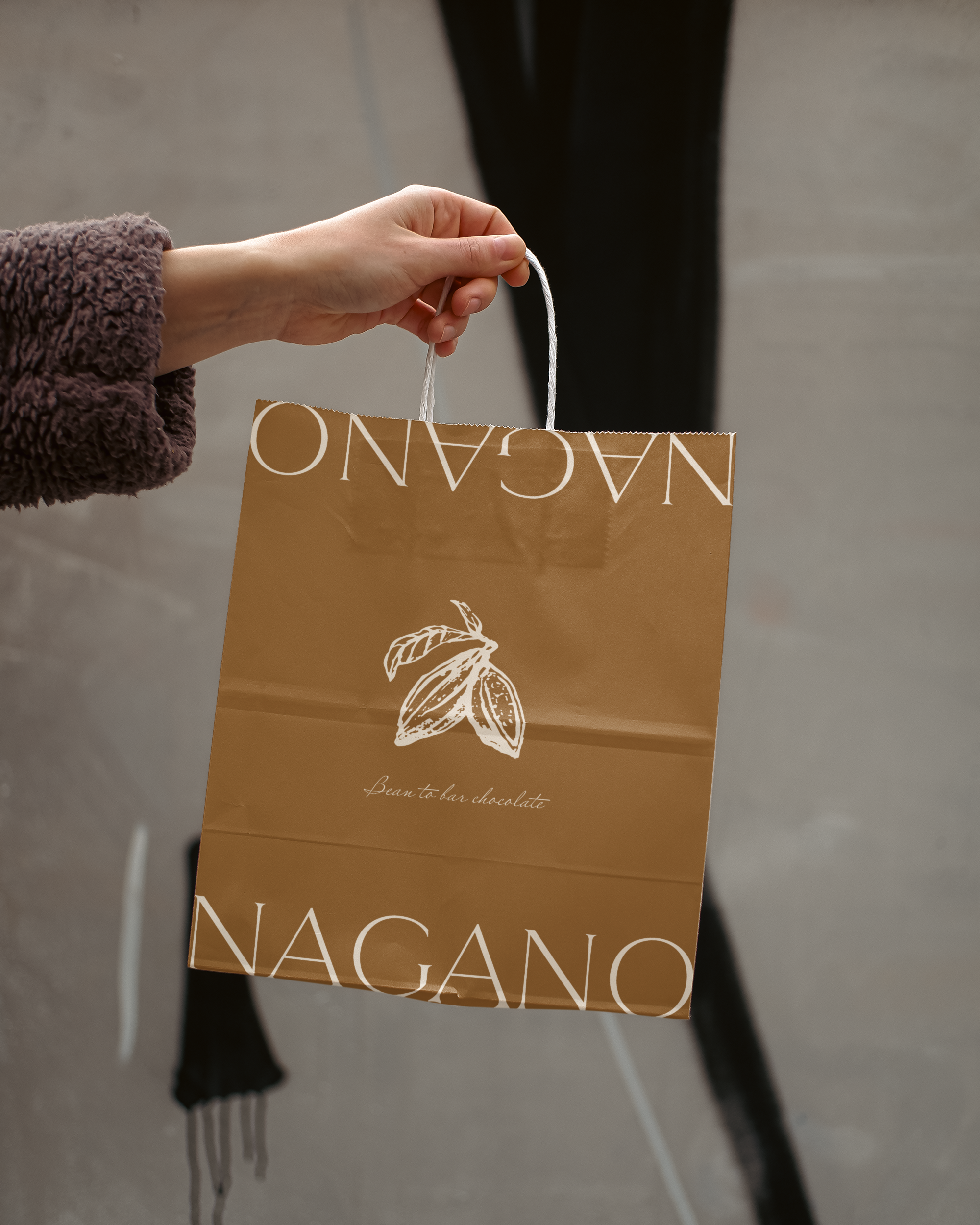
NAGANO Bean to Bar Chocolate, based in Kobe, Japan, meticulously crafts its chocolate bars in-house, from roasting the cocoa beans to creating the final product. I was tasked with designing their logo, incorporating a cocoa bean motif alongside minimalist typography to reflect the brand's high-end, artisanal nature. The logo not only highlights the premium quality of their products but also emphasizes the dedication, craftsmanship, and passion that go into every bar.
To further enhance the design, I introduced subtle cocoa bean cutouts, which are accented with an off-white tone. This design choice allows the elements to seamlessly blend with any product image, adding a layer of sophistication without overpowering the visuals. The simplicity of the logo complements the brand’s focus on purity and attention to detail, while the earthy tones evoke a sense of connection to the natural ingredients used in their chocolate-making process.
In addition to the logo, the packaging design follows a minimalist, luxurious aesthetic that echoes the care and precision in their chocolate-making, ensuring a cohesive and elegant brand experience. This design approach helps NAGANO Bean to Bar Chocolate stand out on the shelves, appealing to consumers who value both the quality of the product and the artistry behind it.


![24-2035 [Converted]_NaganoChocolate.png](https://images.squarespace-cdn.com/content/v1/647a54fe85f77f4dafeec956/7642e721-6273-4f55-9eac-78b997b4c35e/24-2035+%5BConverted%5D_NaganoChocolate.png)
![24-2036 [Converted]_NaganoChocolate.png](https://images.squarespace-cdn.com/content/v1/647a54fe85f77f4dafeec956/03d14852-4627-41dd-af34-43b02f4b05b0/24-2036+%5BConverted%5D_NaganoChocolate.png)


